Decor Art Wallpapers
20 wallpapers
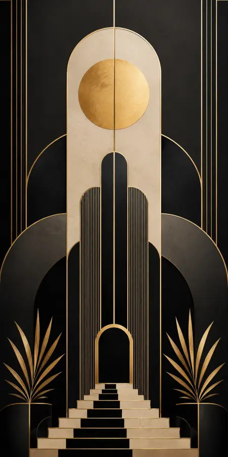
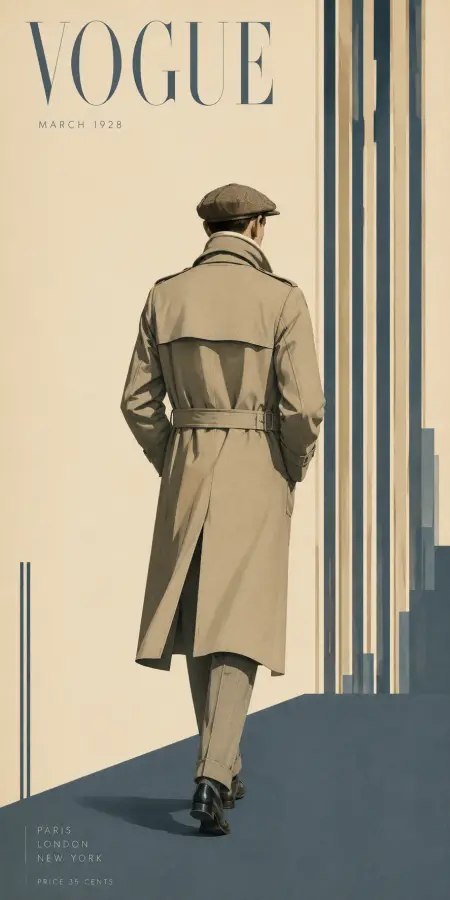
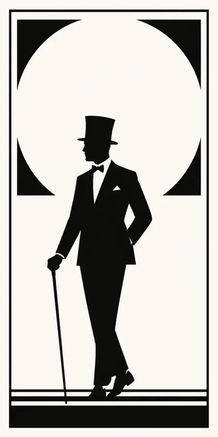
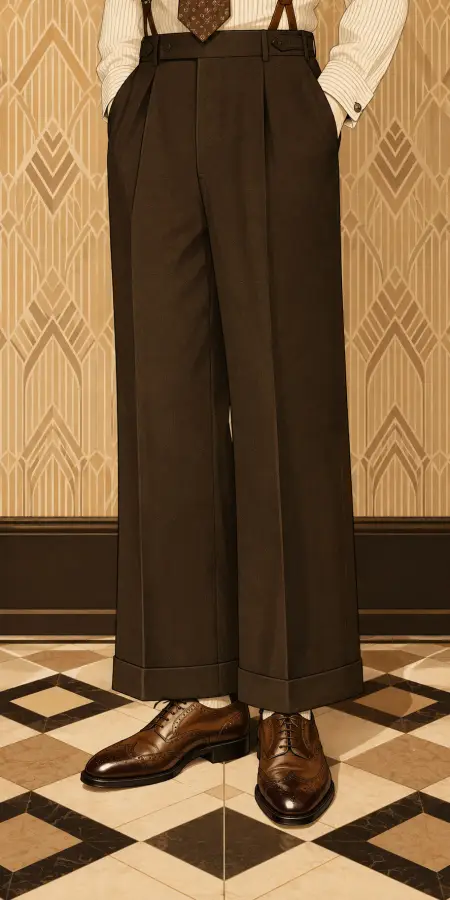
Interior-oriented art: minimal compositions, muted palettes, botanical and abstract forms. Where the poster collection is about impact, this one is about living with something — which makes it the best source on the site for a wallpaper you will not tire of.






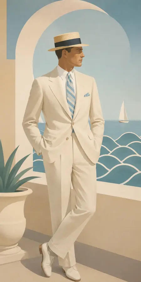





The most practical wallpaper on the site
Striking wallpapers are exhausting. High contrast and saturated colour draw the eye constantly, which is fine for a lock screen you glance at and tiring on a monitor you sit in front of for eight hours. Decor art is built for the opposite: low contrast, restrained palettes, no dominant focal point. It is the collection to use on a working machine.
Muted palettes print well
The same restraint makes these unusually reliable in print. The colours that fail in CMYK are the saturated ones; muted earth tones, off-whites and soft neutrals reproduce on paper close to how they look on screen. If you want something you can both use as a background and frame, this is the collection where that works.
Watch for banding in soft gradients
The one technical caution: very subtle tonal transitions are hard to compress. A soft beige-to-cream wash can show visible steps if the file has been compressed heavily, and it is more noticeable in flat art than in a busy photograph. Check the file size on the page.
Frequently asked questions
What is the best wallpaper for a monitor I work at all day?
Something low contrast with a restrained palette and no dominant focal point — which is what this collection is. Striking, high-contrast images draw the eye constantly and become tiring over a working day.
Do these print well?
Better than most. The muted earth tones and soft neutrals here reproduce in CMYK close to how they appear on screen, where saturated colours do not. Check the pixel dimensions against your print size first.