Houses Wallpapers
41 wallpapers
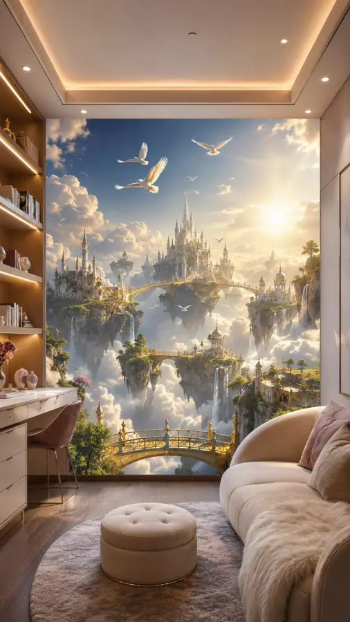
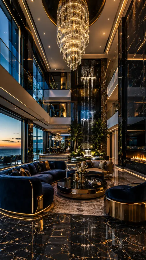
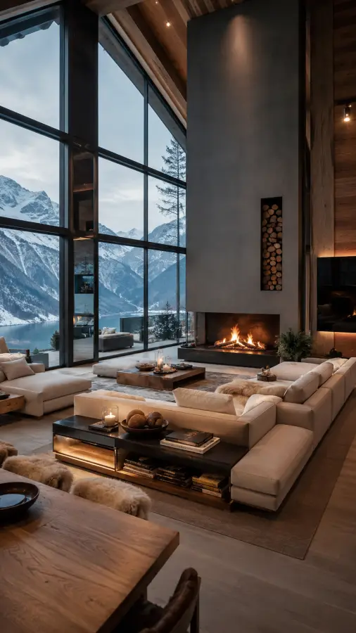
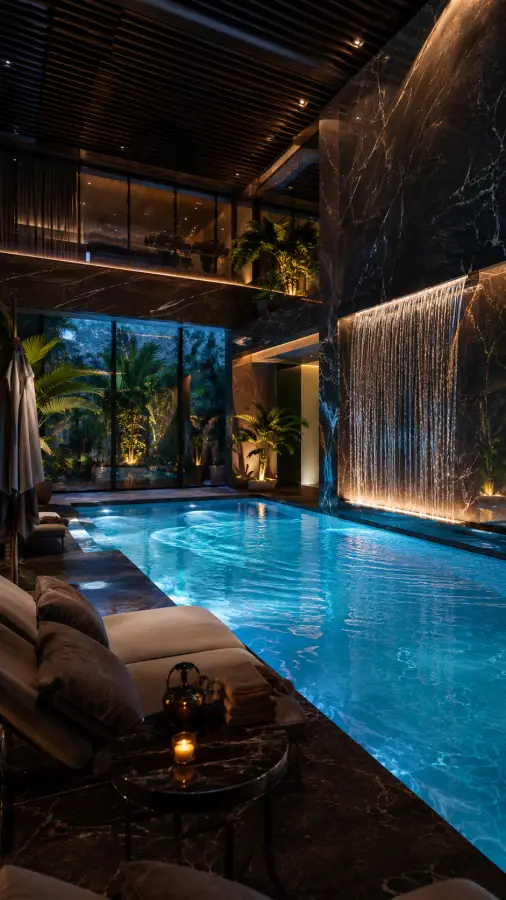
Architectural photography and renders — exteriors, interiors and modern residential design. Architecture makes better wallpaper than most people expect, for a structural reason rather than an aesthetic one.
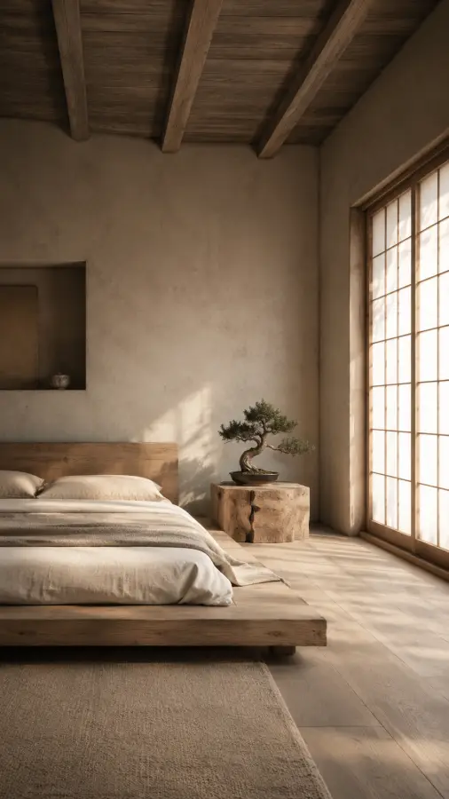
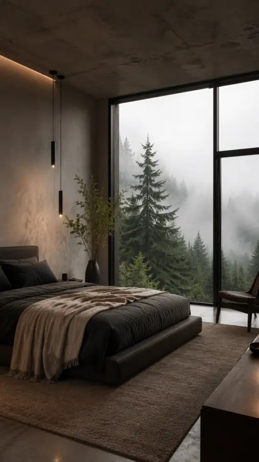
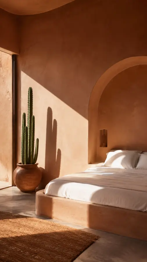
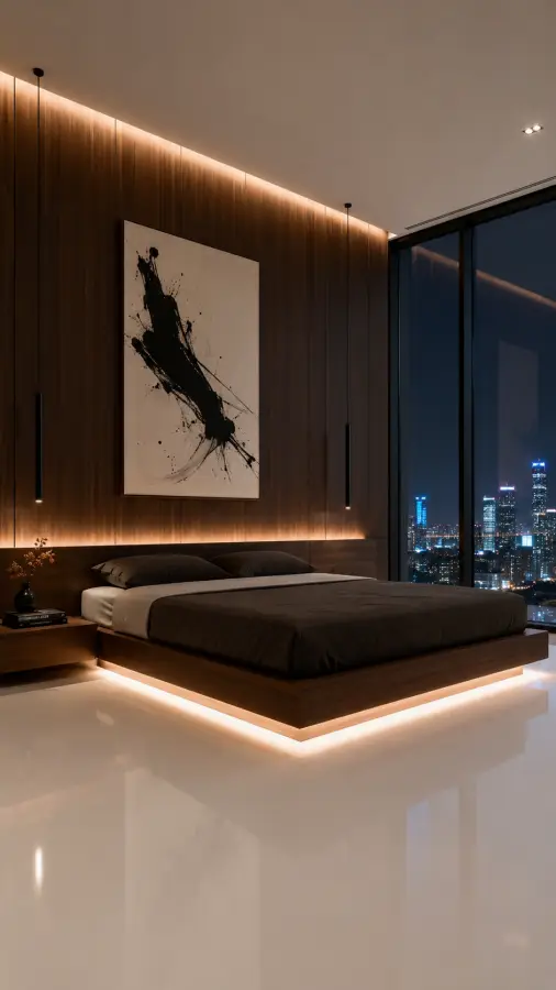
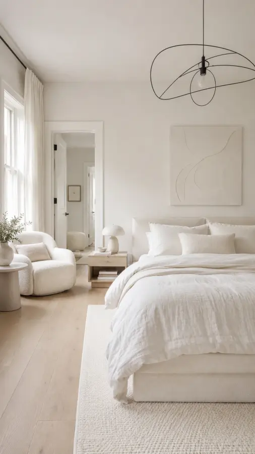
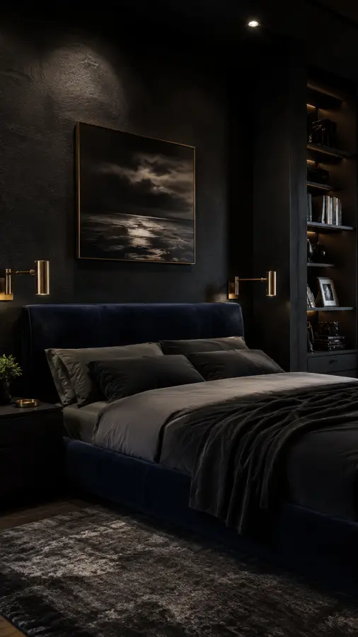
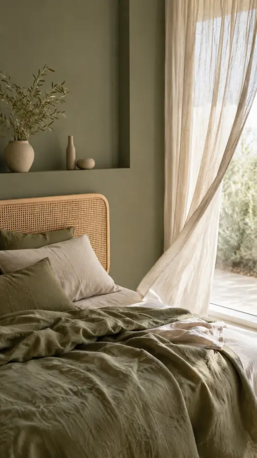
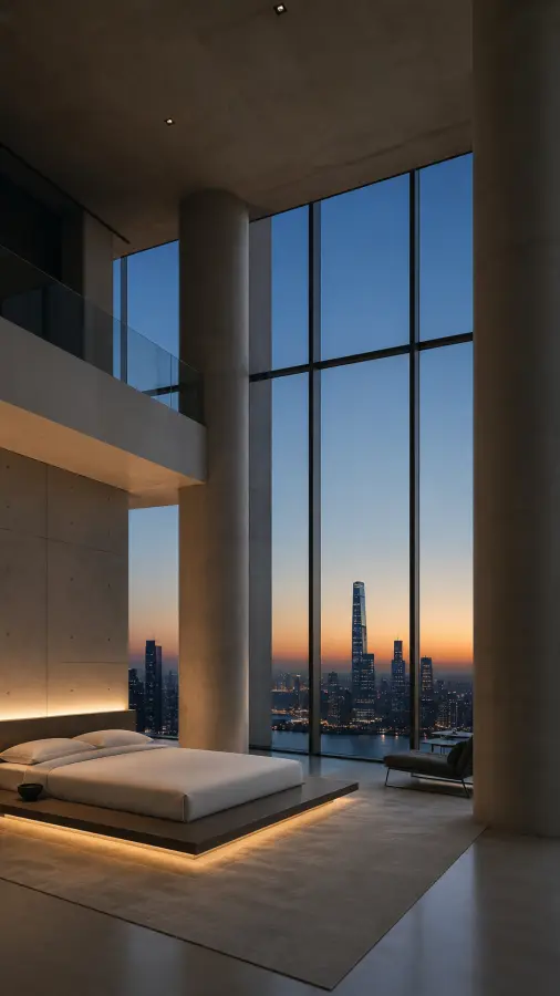
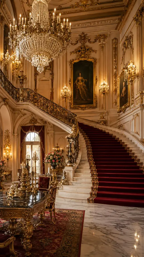
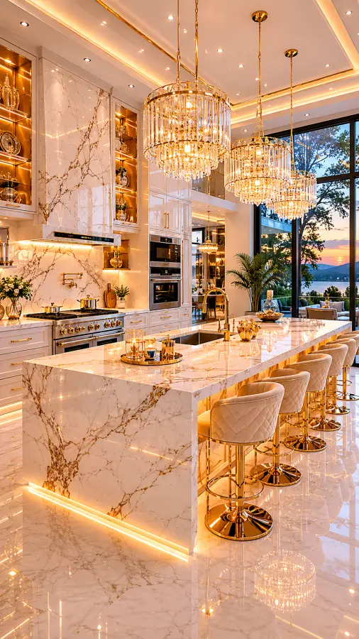
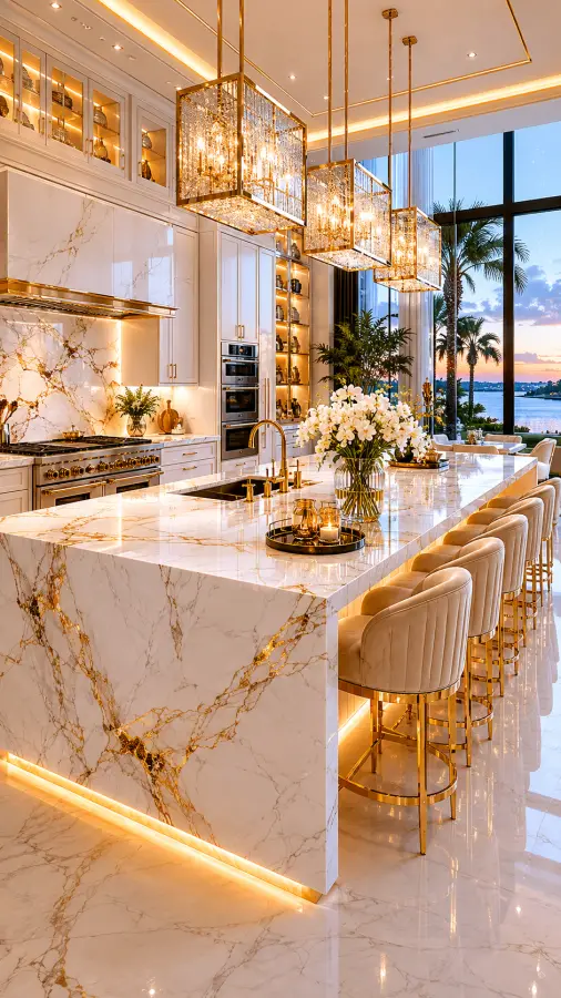
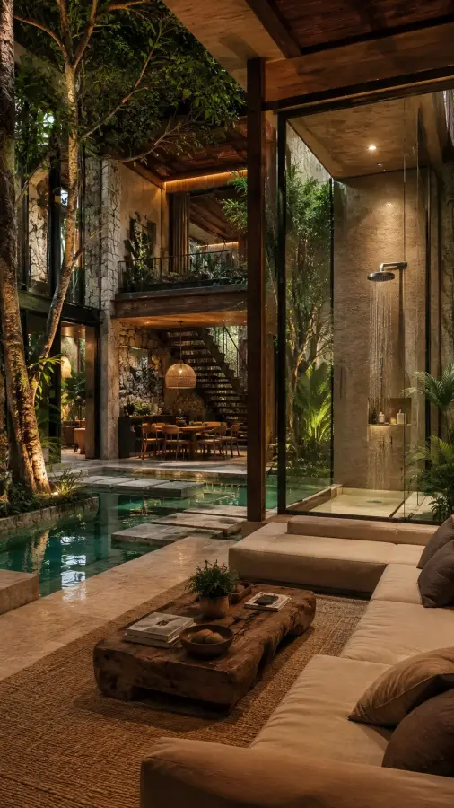
Why architecture sits well behind icons
Architectural images are built on straight lines and large flat planes: walls, glass, floors, sky. That gives you predictable regions of even tone where text stays readable, unlike a photograph with detail scattered across the whole frame. It is the same reason architectural photography is a default choice in software marketing — it holds interface elements gracefully.
Verticals and the crop
One thing to watch: architectural photography is usually corrected so vertical lines stay vertical. If you crop or stretch one of these to fit a screen it does not match, that correction breaks and buildings visibly lean. Match the aspect ratio rather than letting your operating system fill the frame.
Interiors versus exteriors
Interior shots tend to be warmer, softer and lower contrast, which makes them easy to live with on a working machine. Exteriors — particularly against bright sky — are higher contrast and more striking, but harder to place icons on. Both are here; the choice depends on whether the screen is for looking at or working on.
Frequently asked questions
Why do buildings look tilted after I set the wallpaper?
Architectural photography is corrected so verticals stay vertical. If the image is stretched to fit a screen it does not match, that correction breaks and buildings lean. Match the aspect ratio rather than letting the system fill the frame.