Music Posters Wallpapers
10 wallpapers
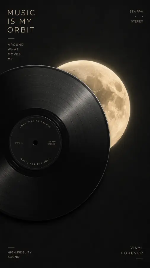
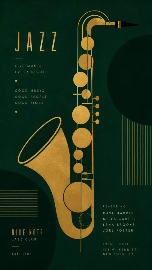
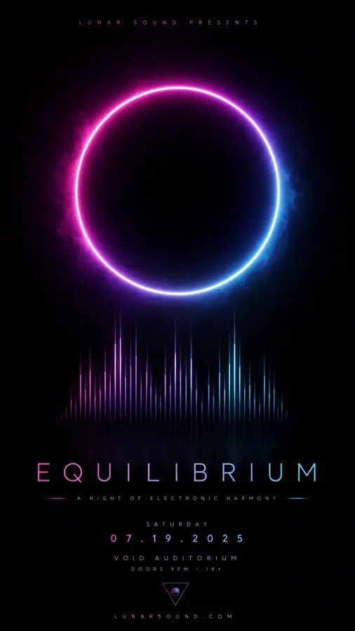
A small set of music-themed poster art within the wider poster collection — typographic pieces, album-inspired layouts and performance imagery. Print-oriented, so resolution matters more here than it would for a screen.
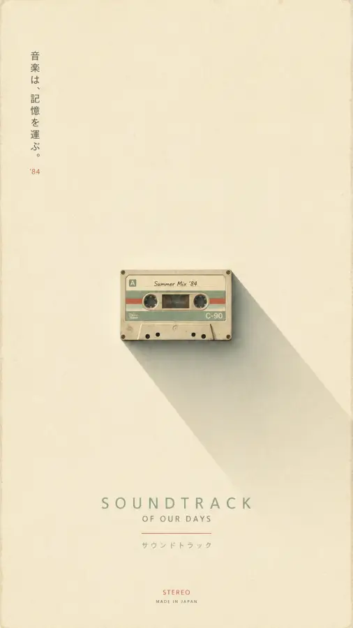
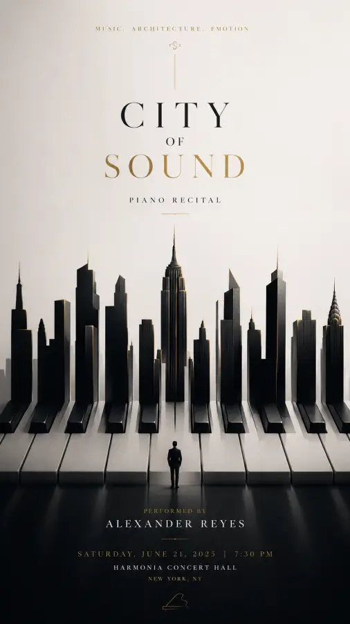
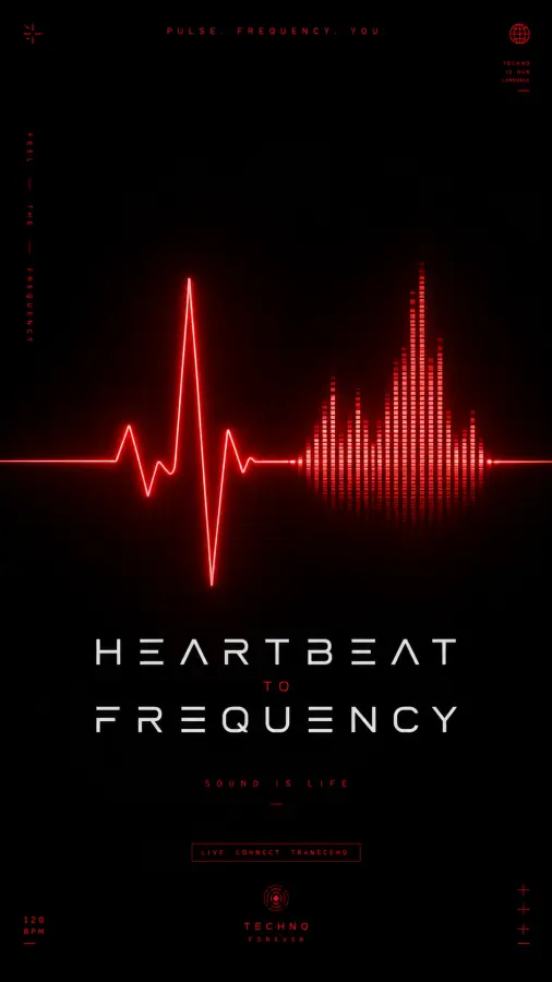
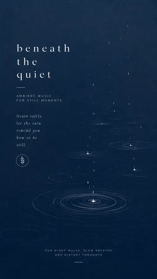
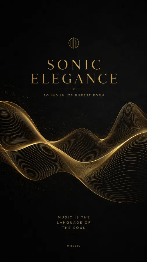
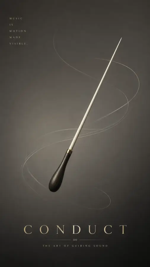
Typography is the thing to check
Music posters lean heavily on type, and text is the most unforgiving element in a print file. A photograph that is slightly under-resolution simply looks soft; text that is under-resolution looks visibly wrong — edges fringe, thin strokes break up, and the eye catches it immediately. Before printing one of these, check the pixel dimensions on the page against the 300 DPI guidance in the parent poster collection.
Flat colour prints predictably
The upside is that typographic and flat-colour poster design reproduces on paper far more reliably than photography. There are no subtle gradients to band and no saturated photographic colours to fall outside CMYK. What you see is broadly what you get.
On rights
Where a piece references an artist, album or band identity, those rights belong to the artist and their label. Printing one for your own wall is fine; selling prints of it is not something our licence can authorise.
Frequently asked questions
Why does the text look rough when I print these?
Type is the most resolution-sensitive element in a print file — thin strokes break up and edges fringe where a photograph would just look soft. Check the pixel dimensions against 300 DPI for your intended print size before ordering.